
UI/UX Design Services
A product can look polished and still confuse the people using it. We start with research, not visuals — understanding how people actually move through your product before we decide what a single screen looks like.

Trust Strip
UI and UX Are Not the Same Job
UX decides if it works. UI decides if it looks right.
UX is the research and structure underneath — how someone finds what they need, how many steps a task takes, where they get stuck. UI is the visual layer on top of that structure. A beautiful interface built on unclear UX still frustrates people; it just does it in a nicer font.
If you already know you want a full website designed, that's a different page.
Our Website Design service covers full visual identity and page design. This page is for when you specifically need the research, wireframing, and usability work — often before a single visual decision gets made, or for an existing product that needs to work better before it needs to look different.
Most redesigns fail for UX reasons, not visual ones
When a redesign doesn’t improve conversion or engagement, it’s rarely because the new version looks worse. It’s usually because the underlying structure — navigation, task flow, information hierarchy — never actually changed. A fresh coat of visual polish on a confusing structure just makes the confusion look nicer.
What We Deliver
Wireframes & User Flows
The skeleton of your product — how screens connect and how a task actually gets completed, before any visual decisions are layered on top.
Interactive Prototypes
Clickable, testable versions of your product before a single line of production code is written — so problems get caught while they’re still cheap to fix.
Design Systems
Reusable components, spacing rules, and interaction patterns so your product stays consistent as it grows, instead of every new screen reinventing its own conventions.
Usability Testing Reports
Real findings from real users — what worked, what confused people, and what we’d change, backed by what we actually observed rather than opinion.
Mobile App UI/UX Design
Mobile UX has its own rules — thumb reach, one-handed use, interruption recovery
A mobile screen isn’t a shrunk-down desktop layout. We design for how people actually hold and use their phones — navigation within thumb reach, flows that survive being interrupted mid-task, and interfaces that stay usable on a small screen without feeling cramped.
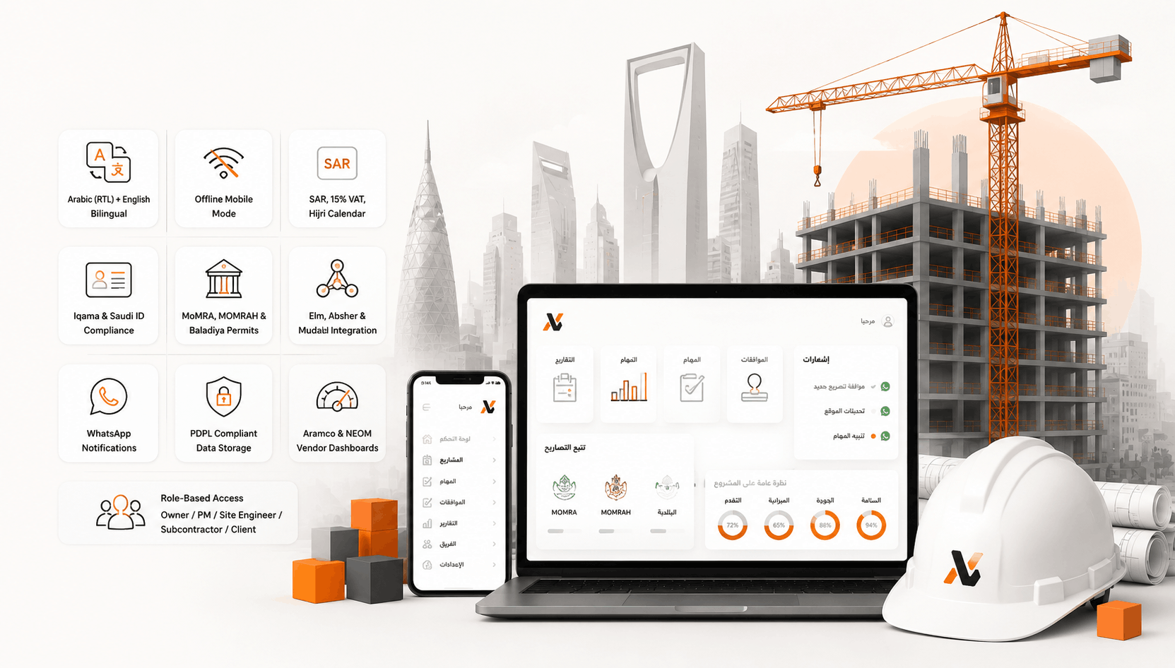
Design Decisions Backed by Research, Not Guesses
We test assumptions before we build around them
A design choice that feels right in a meeting can still fail with real users. Surveys, interviews, and usability testing tell us what’s actually true about how people use your product — not what we assumed going in.
Why a Design System Matters as You Grow
Without one, every new screen quietly drifts from the last
A button that’s slightly different on three different pages isn’t a big deal on its own. Multiply that across a growing product and you get an interface that feels inconsistent even when no single screen looks wrong. A design system fixes that at the source — one set of components, spacing rules, and patterns that every new screen pulls from.
It also makes future work faster, not slower
The upfront cost of building a design system pays off the first time a new feature reuses an existing component instead of a designer building one from scratch — and the tenth time, and the hundredth.
Our UX Process
Research
Interviews, surveys, and audience analysis before any screen gets sketched. We're trying to find out what people actually struggle with, not confirm what we already assumed.
User Flows & Wireframes
Structure first — how someone moves through the product, before color or imagery enter the picture. Getting this wrong is expensive to fix later; getting it right here saves rework down the line.
Prototyping
Clickable prototypes you can actually test with real users, not static mockups you have to imagine interacting with. This is where assumptions either hold up or fall apart.
Usability Testing
Watching real people use the prototype, not guessing where they'll get confused. What the team assumes is intuitive and what a first-time user actually experiences are often two different things.
Handoff
Clean, developer-ready files and documentation — no guessing what a component is supposed to do, and no back-and-forth over what a hover state or error message should look like.
Industries
eCommerce
Healthcare
Fintech & Finance
SaaS & Enterprise Tools

Why Choose Us
We research before we design, not after something breaks
Usability problems are cheaper to catch in a wireframe than in a shipped product — a five-minute fix on paper can be a week of rework once it’s in production code.
Arabic RTL is designed, not mirrored
Interaction patterns, icon direction, and reading flow are considered for Arabic from the first wireframe, not adjusted after the English version is already approved.
You get to test before you commit
Clickable prototypes mean you’re approving something you can actually click through, not just imagining it from a static image — what looks fine in a mockup doesn’t always feel right once you’re navigating it.
FAQ
UX is the research and structure — how someone moves through a product and completes a task. UI is the visual layer built on top of that structure. Both matter, but they’re different skill sets and different conversations, and a project can fail on either one independently of the other.
Often, yes. What feels obvious in a planning meeting doesn’t always hold up with real users. A short round of testing can catch expensive mistakes before development starts, not after — it’s a lot cheaper to change a wireframe than to rebuild a shipped feature.
Yes. We start by understanding what’s actually causing friction in the current product before recommending changes — not every redesign needs to start at zero, and sometimes the fix is smaller than people expect.
Yes. Mobile UX has its own considerations — thumb reach, one-handed use, smaller screens, interruption recovery — that we design for specifically, not as an afterthought to the desktop version.
Wireframes, interactive prototypes, a design system if needed, and usability testing findings — plus developer-ready documentation for handoff, so nothing gets lost in translation between design and development.
Yes. Website Design covers full visual identity and page design. This service is research and structure-focused — often the step before visual design, or for improving how an existing product works before changing how it looks.
Let's find out what's actually confusing your users
Tell us about your product and what’s not working, and we’ll walk you through what a UX review or research project with us would actually look like.