
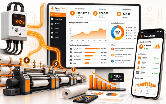
EnergyPulse Analytics
01Project Overview
02The Challenge
Everything ran on clipboards. Someone walked the floor, wrote numbers down, and typed them into a spreadsheet later that day. Sometimes the next.
- The numbers aged badly A reading taken at nine in the morning described a machine that had already changed state twice by the time anyone opened the sheet.
- Nothing could be pinned to anything The group knew what each plant cost. It had no way to say which line, which shift or which department produced that cost, so no target was ever set for anyone.
- Faults announced themselves by invoice A motor drawing far more current than it should can run for weeks. In a manual system the first clue is a bill that looks wrong, and by then the money is gone.
- Plants were not comparable Each site tracked differently. A plant that looked efficient on paper might just have been recording less carefully than its neighbour.
- Every question travelled to head office Floor managers had no live access. Anything energy-related turned into a request, a wait and a reply, usually after the moment had passed.
What they asked for was simple to say and awkward to build. Show us where the power is going while it's going there.
03Our Approach
We spent the first few weeks nowhere near the interface. Energy dashboards are easy to make look good and easy to make useless, and the difference is almost always whether the data underneath can be trusted.
- Start at the meter Direct integration with the meters already installed, so readings come off the hardware. No transcription step means no transcription errors.
- Build for the floor Mobile first, because a manager who gets an alert at a desk is an hour behind a manager who gets it standing at the machine.
- Model usage by unit A data structure mapping every reading to a production unit and department. This is the part that makes accountability possible, and it is unglamorous schema work.
- Learn what normal looks like Baselines per unit, because a spinning frame and a dye house have completely different profiles. One site-wide threshold would have produced noise nobody reads twice.
- Only chart what someone will act on We cut several visualisations during design. If a manager couldn't tell us what they'd do differently after seeing it, it didn't ship.
04What We Delivered
Live Energy Dashboards
Consumption across every plant and unit on one screen, updating as it happens. The collation work that used to eat a week now finishes before the app does.
Automated Spike Alerts
Abnormal draw triggers an alert immediately, with the unit named in it. A fault gets looked at during the same shift instead of surfacing on next month's bill.
Consumption Analytics
Historical patterns, unit comparisons and trends that separate structural waste from a bad afternoon. Managers stopped guessing which machine to investigate first.
05How It Works
One path, meter to phone. Captured at source, checked against a baseline, delivered as something a person can act on.
PLANT METERS · multiple sites
  Live draw  ·  unit-wise readings
      │  direct meter integration
      ▼
BACKEND · Laravel, REST APIs
  Ingest → normalise → store  ·  per-unit baselines  ·  spike detection
      │
      ▼
MOBILE APP · Flutter
  Dashboards  ·  visual analytics  ·  alerts
      │
      ▼
PLANT MANAGER · on the floor
Sees the spike, walks to the machine, fixes it this shift06What the System Tracks
Real-Time Consumption
Live electricity draw streamed from every connected plant, with nobody writing anything down along the way.
Unit-Wise Usage
Usage split by production unit and department, which turns a plant total into a number somebody owns.
Abnormal Spikes
Surges measured against that unit's own baseline and flagged straight away, rather than at the end of a reporting cycle.
High-Consumption Areas
The heaviest users ranked, so efficiency effort lands where it will actually move the bill.
Meter-Level Integration
Readings taken from the hardware itself, which removed a whole category of error from the chain.
Cross-Plant Comparison
One measurement basis across sites. Now a site that looks efficient probably is.
07Results and Impact
08Conclusion
The interesting part of this project was never the dashboards. It was that the data had existed the whole time, sitting in meters nobody was reading, describing a cost the business had quietly accepted as fixed. Textiles is where we happened to build it. The same gap shows up anywhere expensive equipment runs across multiple sites and the people who could fix a problem are the last to hear about it.
09Project Summary
| EnergyPulse Analytics | Mobile app, backend, meter integration |
| Manufacturing and energy management | Textile group, multiple plants |
| Real-time, unit-wise electricity monitoring | Plant managers and operations teams |
| Flutter, Laravel, REST APIs | End to end by VirtueNetz |
10Technologies Used
11Questions We Get About This Build
It reads electricity consumption directly from plant meters, breaks the usage down by production unit or department, and shows it as live dashboards and alerts. A utility bill tells you what a site spent last month. This tells you which machine is spending it right now, which is the part you can do something about.
By shortening the delay between waste starting and somebody noticing. A failing motor or a compressor left running overnight can cost for weeks before anything looks unusual on an invoice. Continuous readings with automatic alerts move that discovery to the same shift.
Usually no. Where meters already expose readable output, we integrate with what is on site. Some older units cannot be read and do need an addition, but that is the exception, and we work it out during discovery before anyone commits to hardware spend.
Because the useful reaction happens on the plant floor. A web-only dashboard means the alert waits until somebody sits down at a workstation, and by then you have thrown away most of the value of catching it early. A web view is fine as a second surface for planners and finance.
Multi-site is where it pays for itself. A shared measurement basis is what makes comparison honest. Without it you cannot tell an efficient plant from a badly recorded one, which was one of this client's original problems.
Flutter for the mobile app, Laravel for the backend and REST APIs, plus an integration layer handling ingestion, normalisation and spike detection. We chose the stack partly for one codebase across iOS and Android, and partly because the client's own developers could pick the backend up later.
It depends far more on meter access than on software. Where readings are already available in a usable form, a first working version comes quickly. Where they are not, the integration layer becomes the project and the timeline follows it. We scope after seeing what the meters actually give us.
Building something that needs to monitor, alert or analyse?
We ship real-time platforms end to end, from the integration layer through to the screen someone actually uses. Have a look at the rest of our portfolio, or just tell us what you are trying to measure.
Start a ProjectLet's talk about your project
Tell us what needs measuring and who has to act on it. An engineer reads it, not a sales script, and you get an honest view on scope before anyone mentions a proposal.
Start a Project
Let's Talk About
Your Project
In our first call, we will talk about your project needs and goals and will share with you how we can rapidly increase the performance and value of your investment.